Fiddler’s Green Farm
My uncle, Jim Eldon, asked me to update the logo and signage for his farmer’s market stand. The sign for Fiddler’s Green Farm hadn’t been updated since its initial creation in the 90’s, when it was hand-painted on a piece of wood.
The original business card had been done in Microsoft Word. Time for an update!
At first I based my redesigns on a leaf of arugula, because to me “fiddler’s green” makes me think of leafy greens, not asparagus.
Jim felt, however, that the asparagus was recognizable branding and wanted to simply update the old look. I traced over the asparagus and made sure the outlines were clean and clear unlike the old pixelated version, and then set the farm name in Quaver Serif Regular.
There were some requirements for the banner sign on the stall. All the farmers at the market were required to write, “Certified organic since _”, “we grow what we sell”, include their address and phone number, and the CCOF certification seal. I set “organic vegetables” the heaviest, in Futura Demi, because I felt that it was the most important information and needed to be read from a distance. Having produce that is organic is a huge selling point at the farmer’s market, and because the stalls are always in the same place I felt that this was more important than the farm name.
The colors for the brand are earthy greens and a lighter dusty green, taken from the gradient in the asparagus.
Quaver Serif Regular
My happy, goofball of an uncle, smiling in front of his nice new canvas banner.
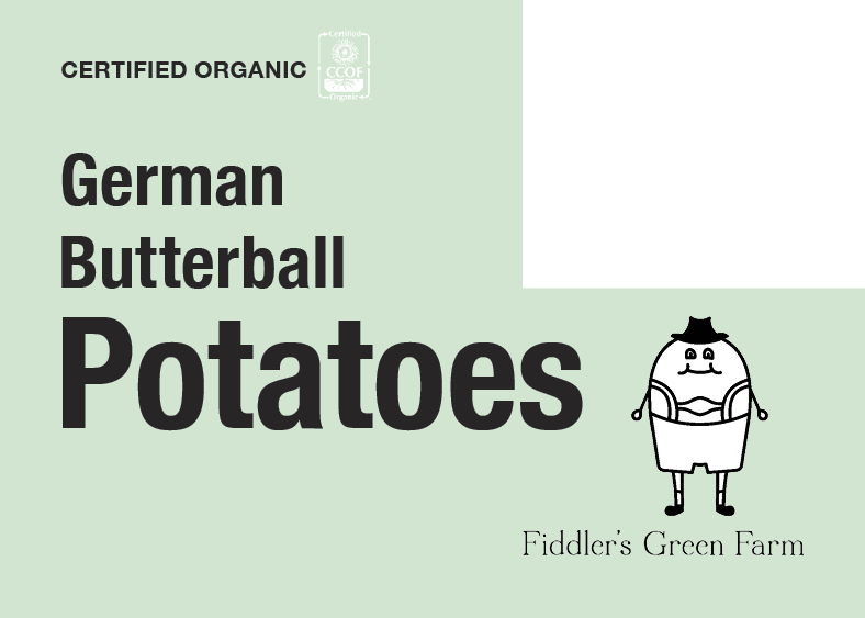
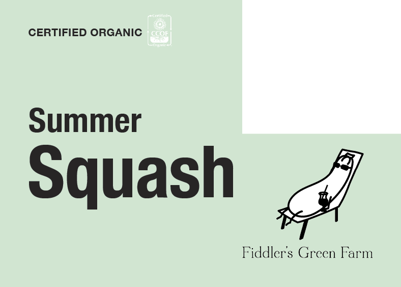
I included the above picture of my goofy uncle to give an idea of where the next design request was coming from. He asked me to re-do all of his small label signs for the individual baskets, which you can also see in that photo clothes-pinned to the baskets. His biggest directive was that they had to be visually funny. I ended up writing one-liner vegetable puns (which were embarrassingly easy for me to come up with), and illustrating the vegetables either as jokes themselves or as plain black and white drawings.


I love illustrating, so I saved the vegetable illustrations separately to showcase them.
And this is where the job got… really weird. As much as Jim said he liked the jokes and illustrations, they weren’t quite what he meant. He showed me an example of one of his old signs that he had made himself in Microsoft Word, where the background image was of fashion mannequins. Thus began the task of using Photoshop to create what I ended up calling “visual Dadaism”- photo non-sequiturs that had nothing to do with vegetables, farming, or anything really. I can’t explain much better than that, but suffice it to say he was thrilled when I made the rest of the signs look something like these:


Without a doubt this was the strangest design job I’ve ever done, but it did have a lot of elements of professional design. First, I had to stay away from images of food so I didn’t create an unappetizing association with the farm vegetables. Then I had to put all my Photoshopping skills to the test to create the wonders of salmon in pants and medieval alien royalty. Then the images had to be set on the signs in a way that wasn’t obtrusive to the text. Jim loved every one of these signs, and at the end of the day my job as a designer is to make the client happy.


