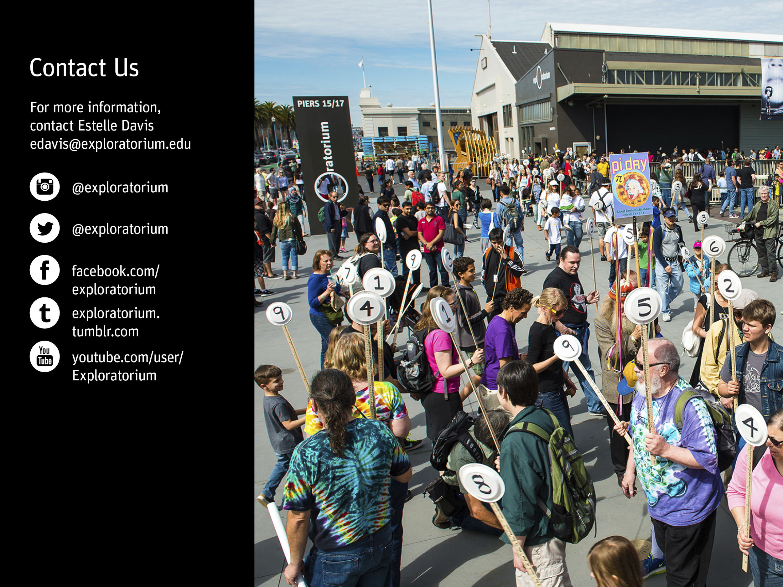
Pitch Deck


I interned as the San Francisco Exploratorium’s first graphic design intern this previous summer, and this “pitch deck” was my first project with them. The pitch deck detailed the events and demographics at the Exploratorium as part of the corporate engagement’s efforts to bring in sponsors for our events. Their initial slideshow presentation was done in Google Slides, which didn’t allow for usage of the Exploratorium’s branding to be utilized.
Below are the pertinent pages from the brand guideline:
To quickly summarize this information, the brand visual is reversed out text with the Exploratorium typeface, “Explo,” which must be set with -25pt optical tracking. The color pallet is primarily black and white with a medium gray, and the secondary pallet is only six colors to be used as 10% of the overall design. The logo, with its very large circular O in the middle, can only be used at a minimum of 1”, must always be black and white, must have nothing within the O because it represents a portal to a world of exploration, and can only be horizontal or rotated 90 degrees’ counter-clockwise. The Exploratorium primarily uses photos instead of illustrations or icons in its branding, which is made easy by the in-house photography team.
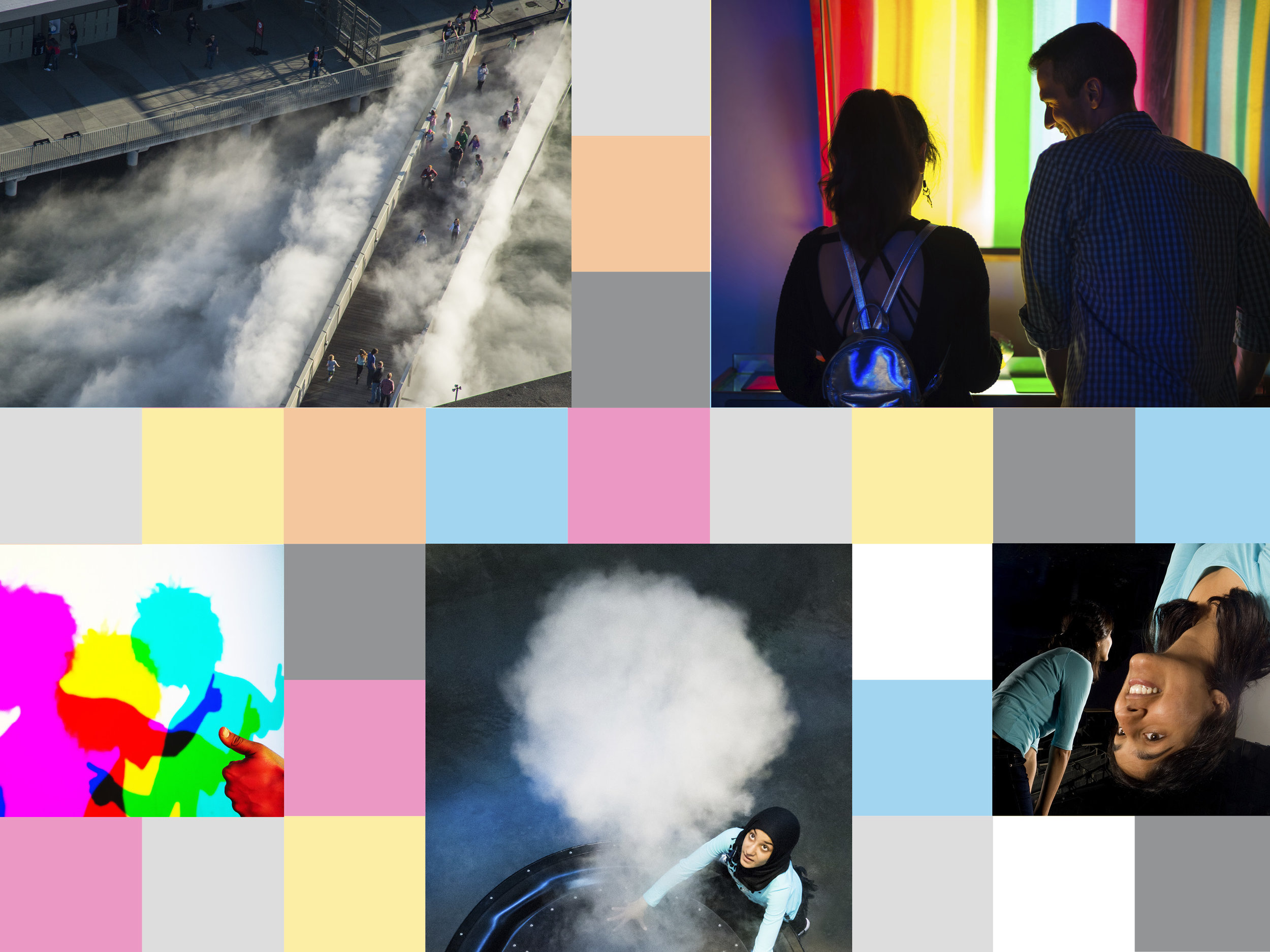
The first pitch deck on Google Slides looked like this:
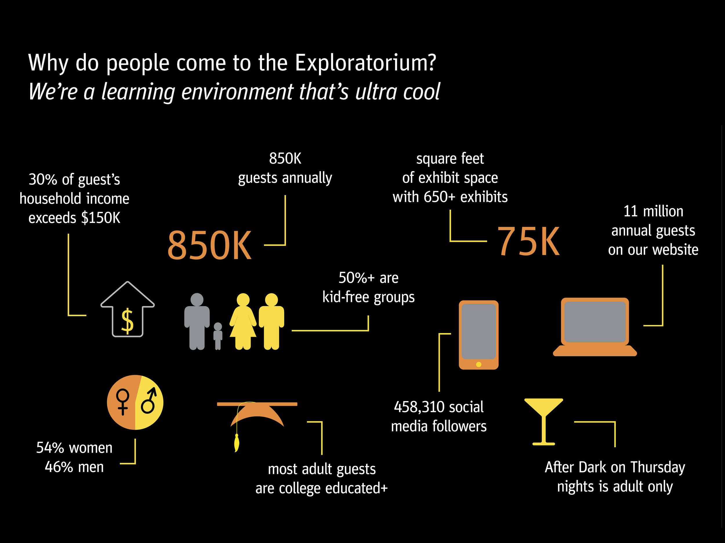
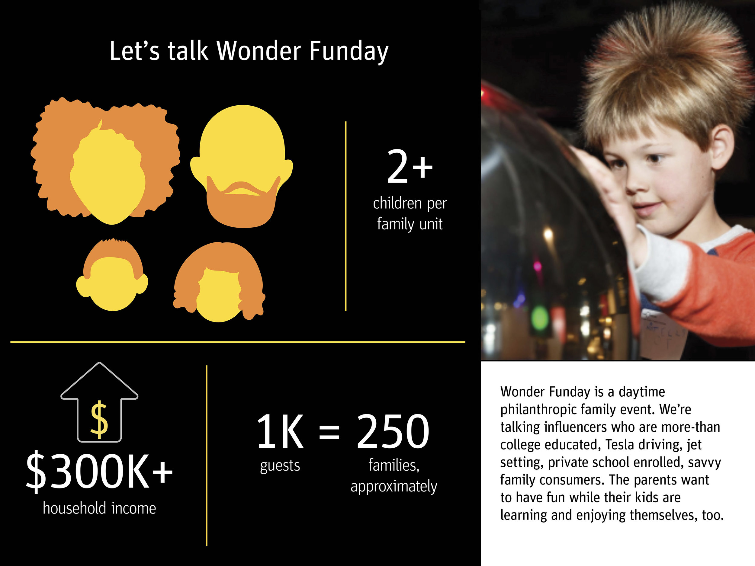
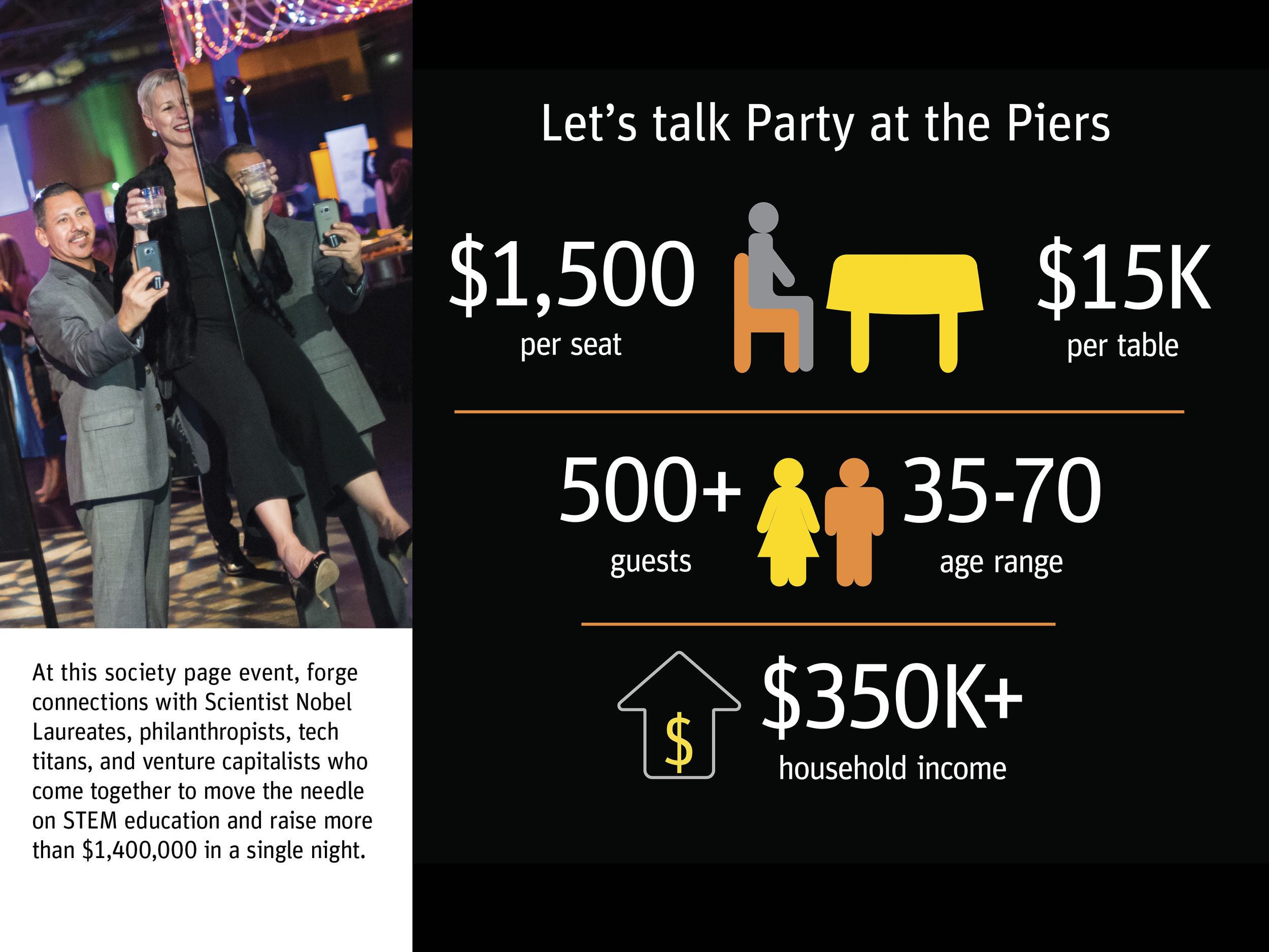
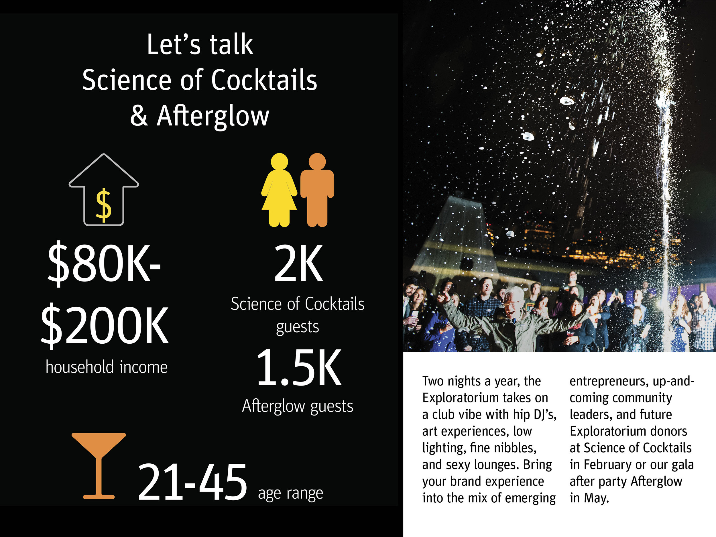
The design brief, given by Estelle Davis from the corporate engagement team, was to give potential sponsors the sense that our events were perfect for experiential marketing. When I asked for adjectives to describe her idea of what the perfect pitch deck would look like, she said fun, casual but professional, family-oriented for some events and upscale for others. Once we had that meeting, I began creating illustrated infographs for each of the events using the raw demographic data. My creative director Lara McCormick allowed the special case use of illustrations for the infographs as long as most of the deck had photos.
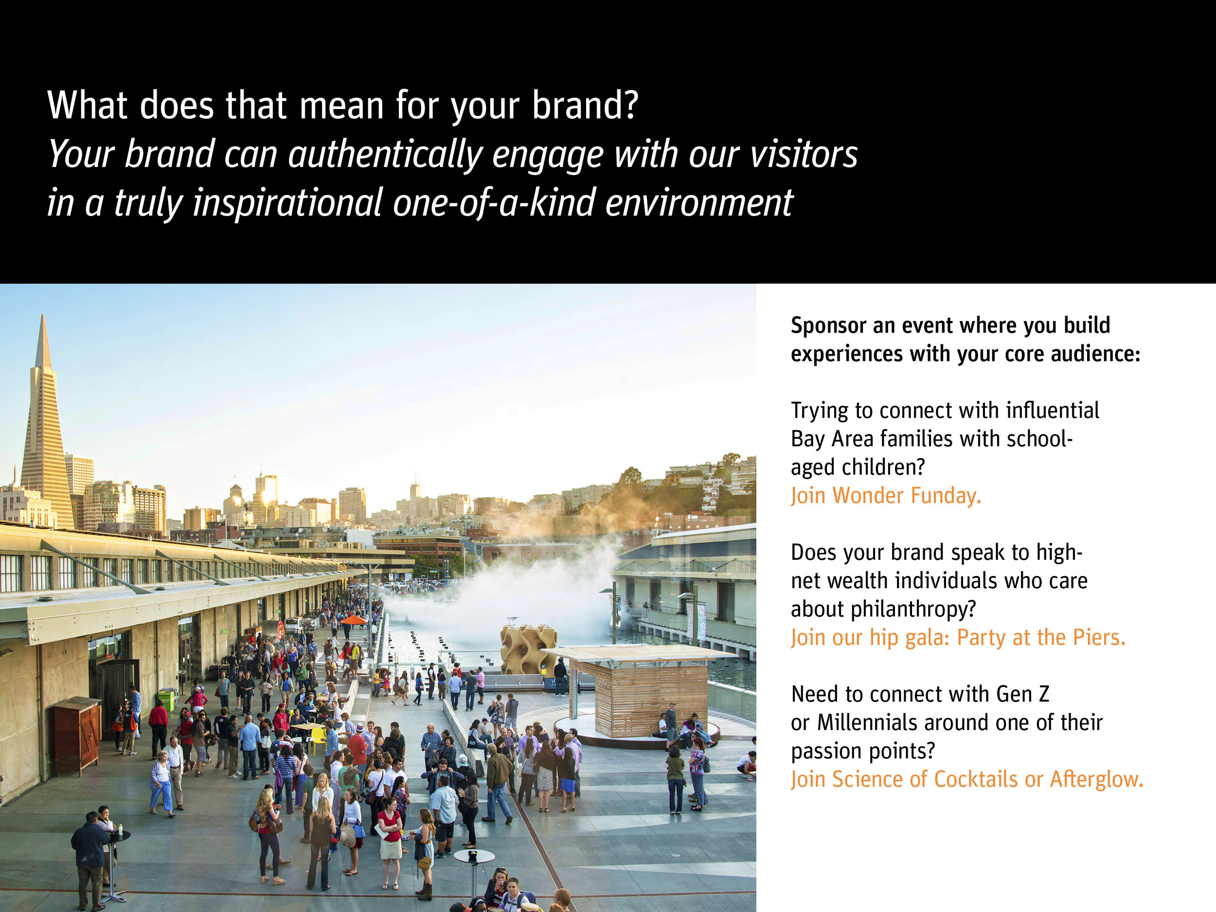
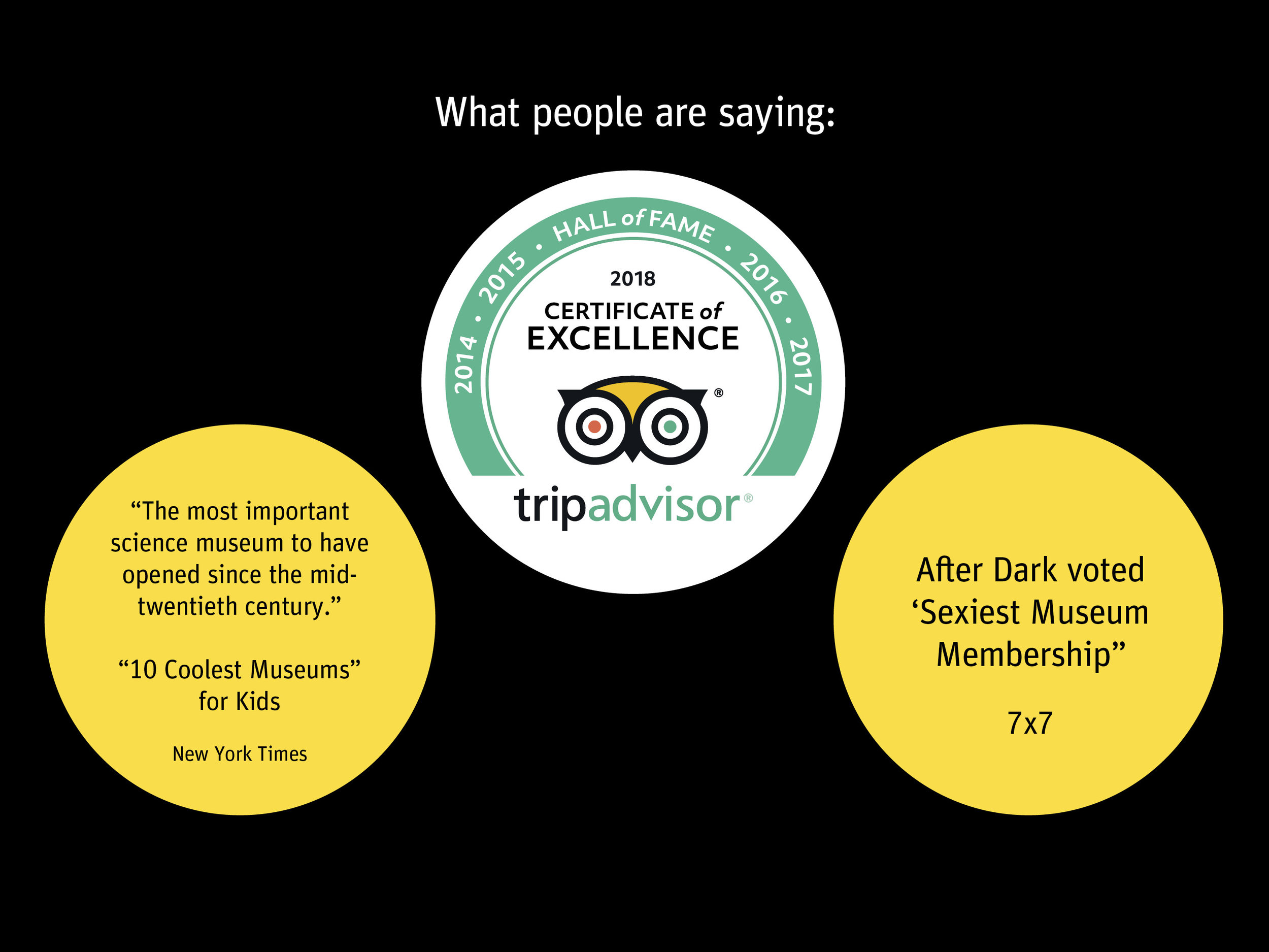
When I sent the first version of the pitch deck corporate engagement team for feedback, they were happy with it and said I had “really understood the vision.” After a few changes from them and typography feedback from Lara, the final version went out and is still happily getting rave reviews:
The infograph on the left of this slide got my favorite feedback to date, which was to make the family look more multi-ethnic than the first version of my illustration did.
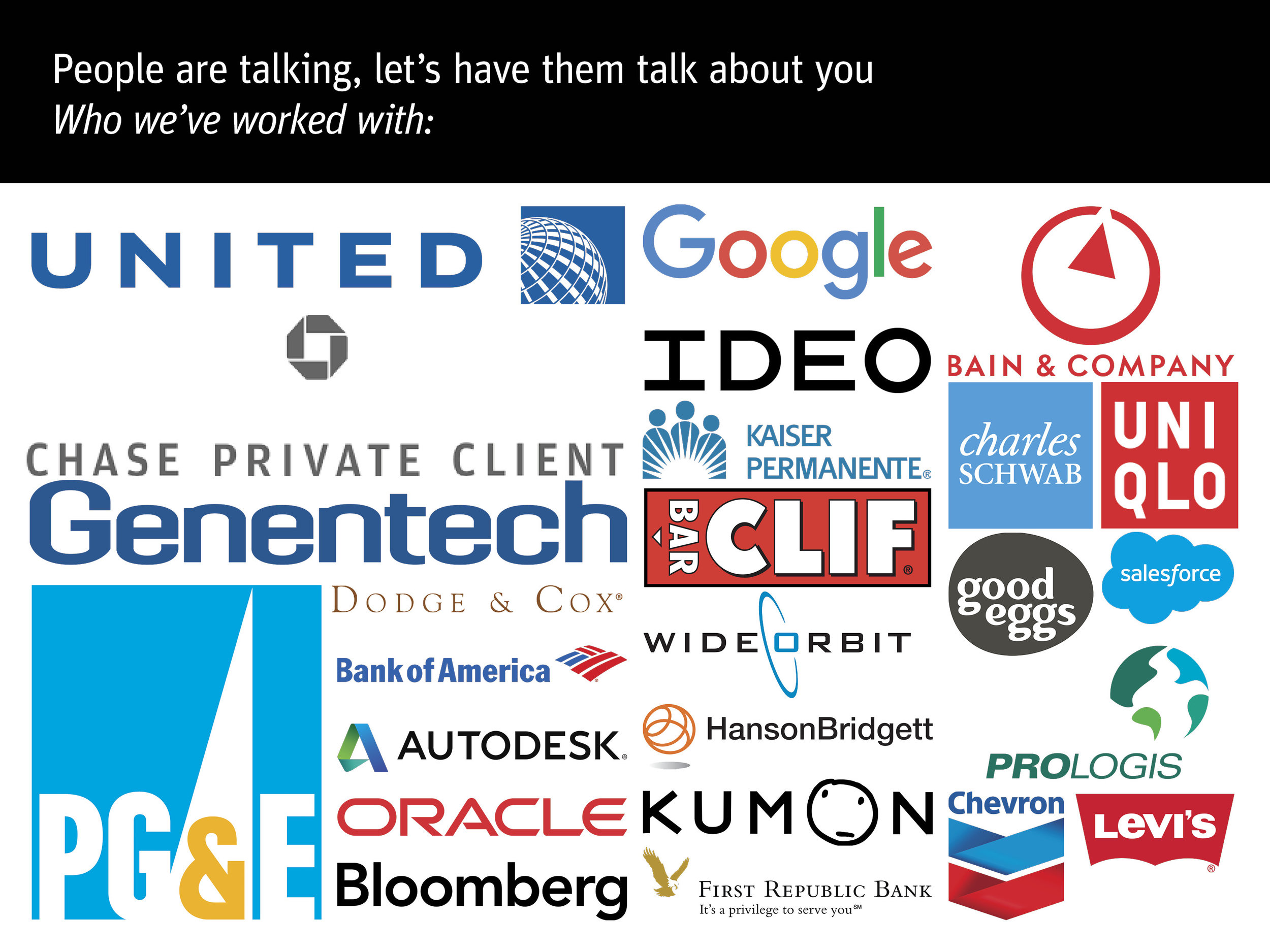
This slide was probably the trickiest to organize- I created a grid with the biggest sponsors in a large column on the left, then 1.5 smaller columns of rectangular logos in the middle, then the square and oddly shaped logos on the far right. I had never wished that there was a standard logo size and ratio before this.