Konakopa
This project started as an ad for a fictional coffee company that I had initially used in my magazine spread. I decided I liked the concept so much I created more packaging and branding. The challenge was to create a coffee brand that had a rustic minimalist style with an Old West edge.
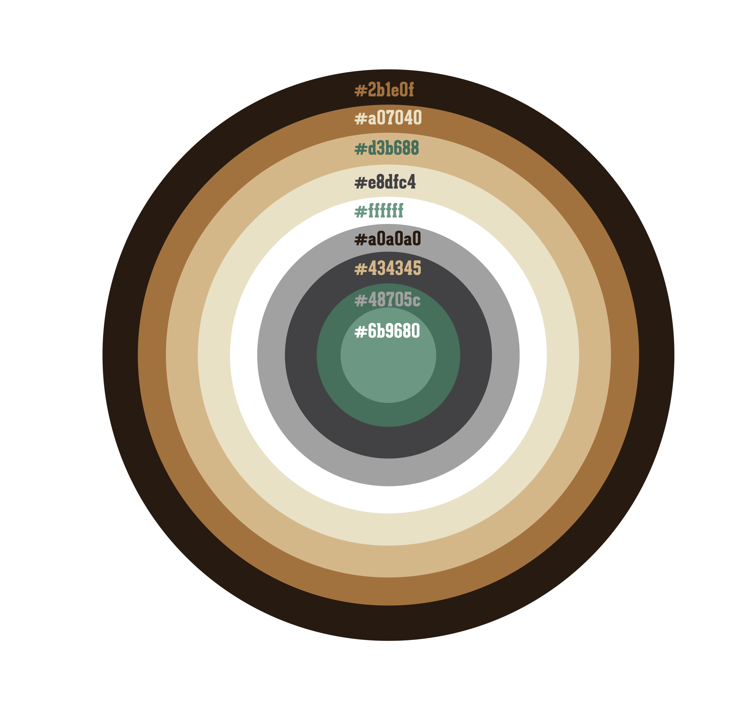
The company name “Konakopa” is from the Hawaiian town “Kona” and the Hawaiian word for coffee, which is “kopa”. The logo is Geared Slab that I manipulated onto a curve for the “Konakopa” name. I used Fertigo Pro Script Regular for the “Kona Coffee” text, and added hand-drawn illustrations of a coffee bean and two arrows. I used Dapifer for setting all my body texts on print and web materials because it’s a light typeface with long serifs, which fit with the Western idea without being distracting or unreadable. The color scheme is browns, tans, grays, and greens, which rounded out rustic effect.
In keeping with the rustic minimalist and western tone, the packaging is all paper with only a small plastic “window” to see the beans inside. I did flavor illustrations for the shop page of the website, and kept the same theme of hatch shading that is on the original bean from the logo.
Color Scheme
Geared Slab Extrabold
Fertigo Script
Dapifer
The website is a mix of those illustrations and product photos, with a large photo of the “farm” on the About page. The web and print ads echo the rustic minimalism of the over-all brand.


