Magazine Design
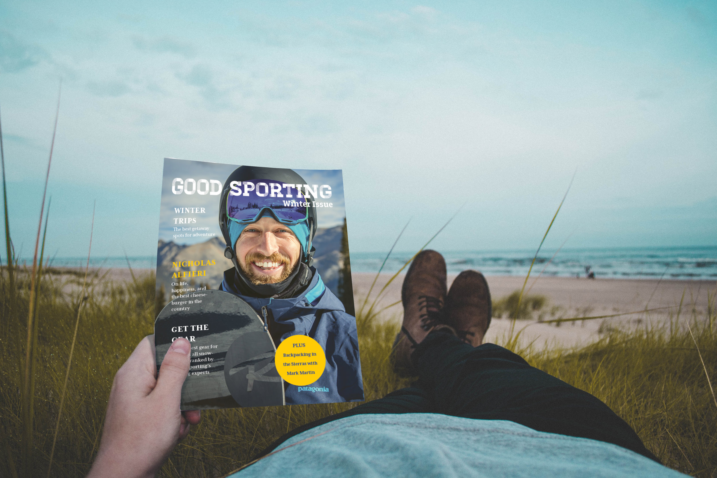
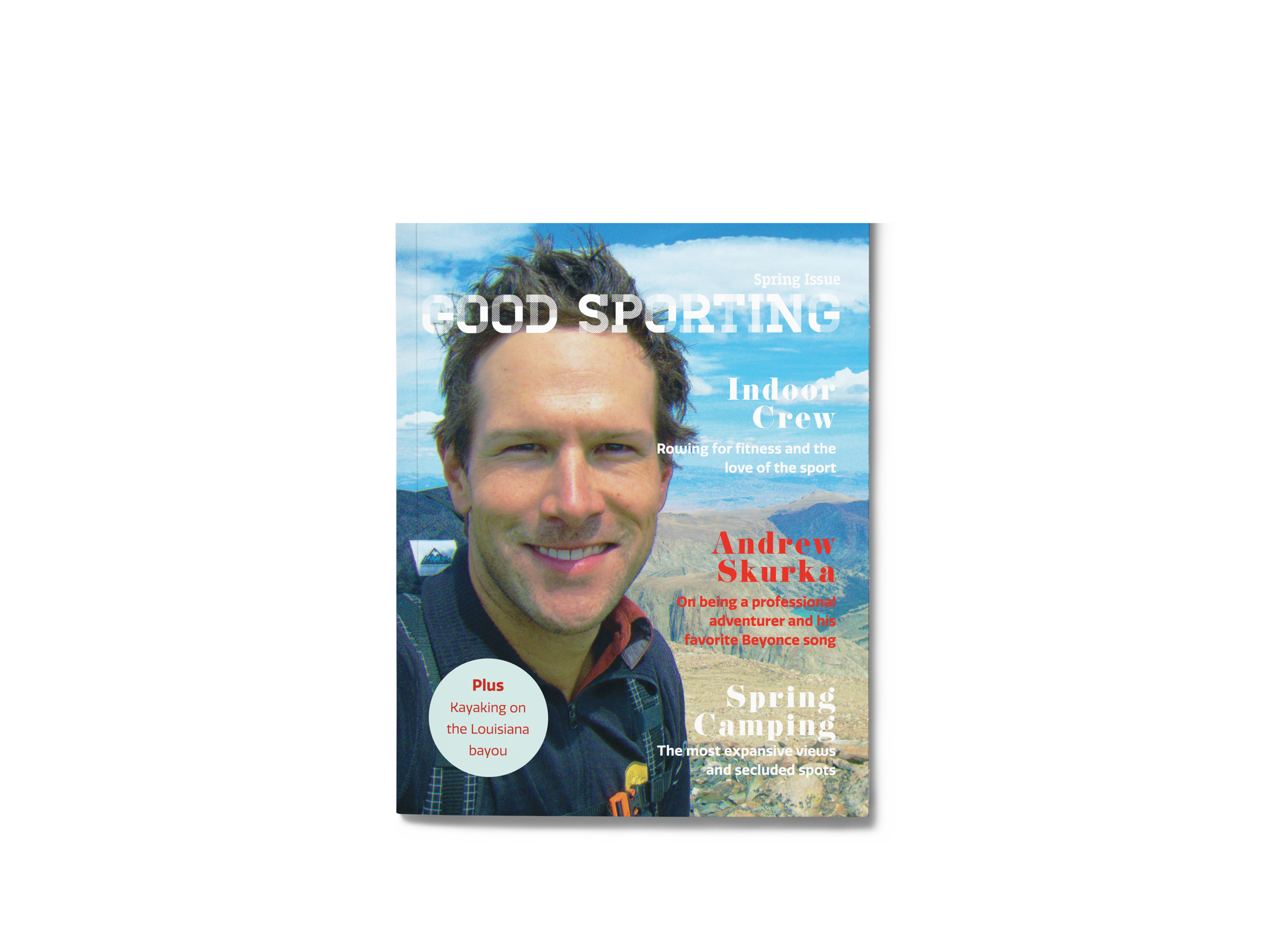
Good Sporting is a fictional outdoor sports magazine that I created in my certificate program, the target audience of which I would call “fancy men”. I focused on high-end brands, comfortable life-style imagery and rustic minimalism, all with the idea of appealing to a sporty but well-off male audience. The challenge was to create spreads with appealing visuals and clean typography to convey a desirable outdoor lifestyle mixed with creature comforts.
Working with minimalism was a personal challenge that I asked of myself because I tend to be a maximalist. My favorite phrase is “less is more, but more is also more”. However, for this, I pushed myself to try “less is more.” I tried to remember Coco Chanel’s fashion advice, “take on thing off before you leave the house,” and how that could apply the design process; How much really needed to be on the page to get the effect I wanted?
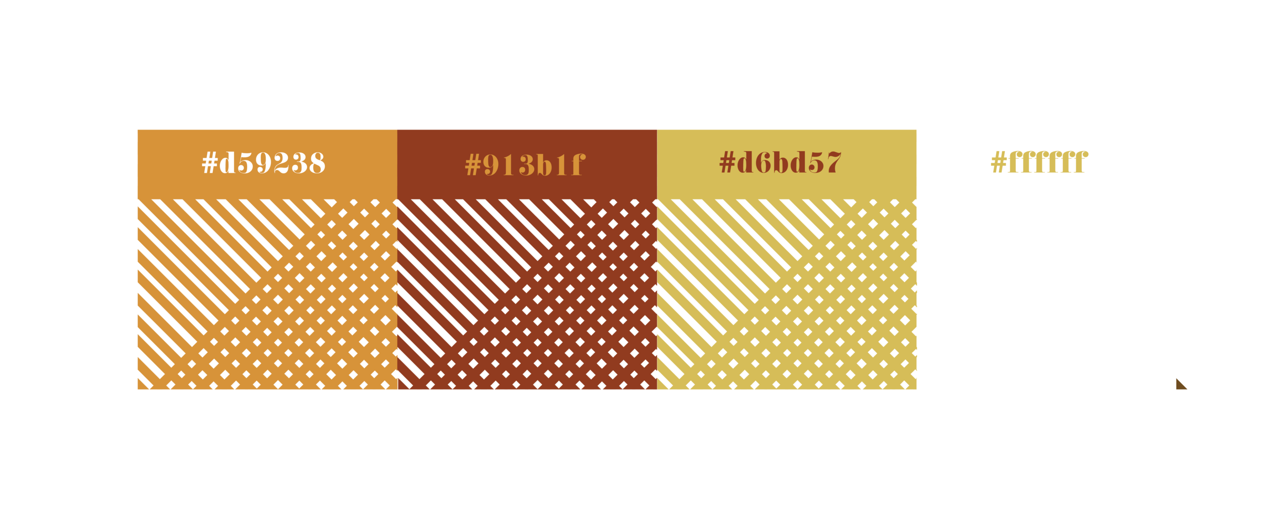
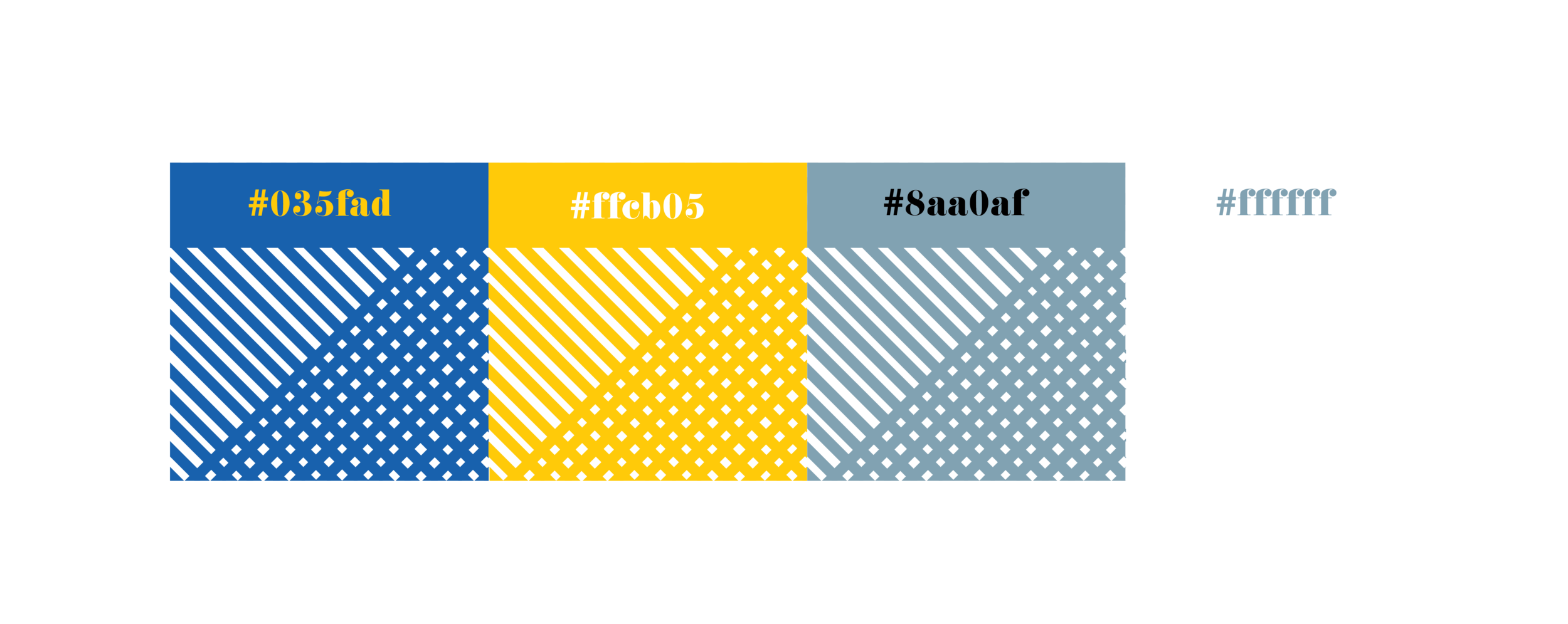
Ultimately, I decided that the best way to get that effect was to use crisp, high resolution photos as full pages, didone fonts, and large negative spaces. I chose Didoni for my headings, Quatro for my sub-headers, and Source Sans Pro for my body text. The magazine title is the typeface Homestead. The colors I chose are only represented on the magazine cover and the table of contents, while the spread’s colors came from the photos. I’m happy I challenged myself this way, and I believe the results are effective.

Source Sans Pro

Homestead


Quatro

Didoni